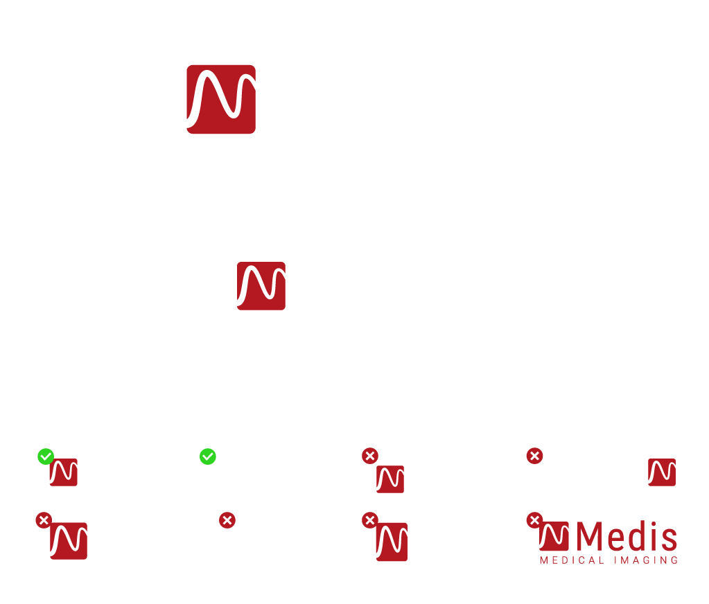
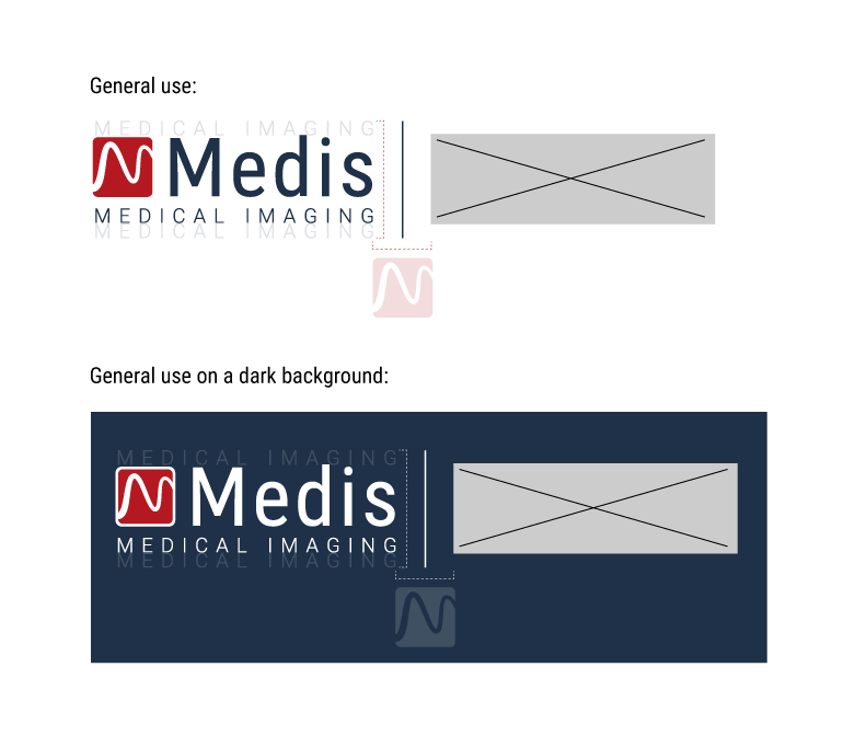
The Medis logo is a combination mark and consists of an icon and a wordmark. The icon is never to be used seperate from the wordmark, except for the UI of our software and as an icon on the corporate website. The icon can be used as an indicator of spacing around the logo. This applies to edges of a document and the spacing of the logo relative to other visual elements.
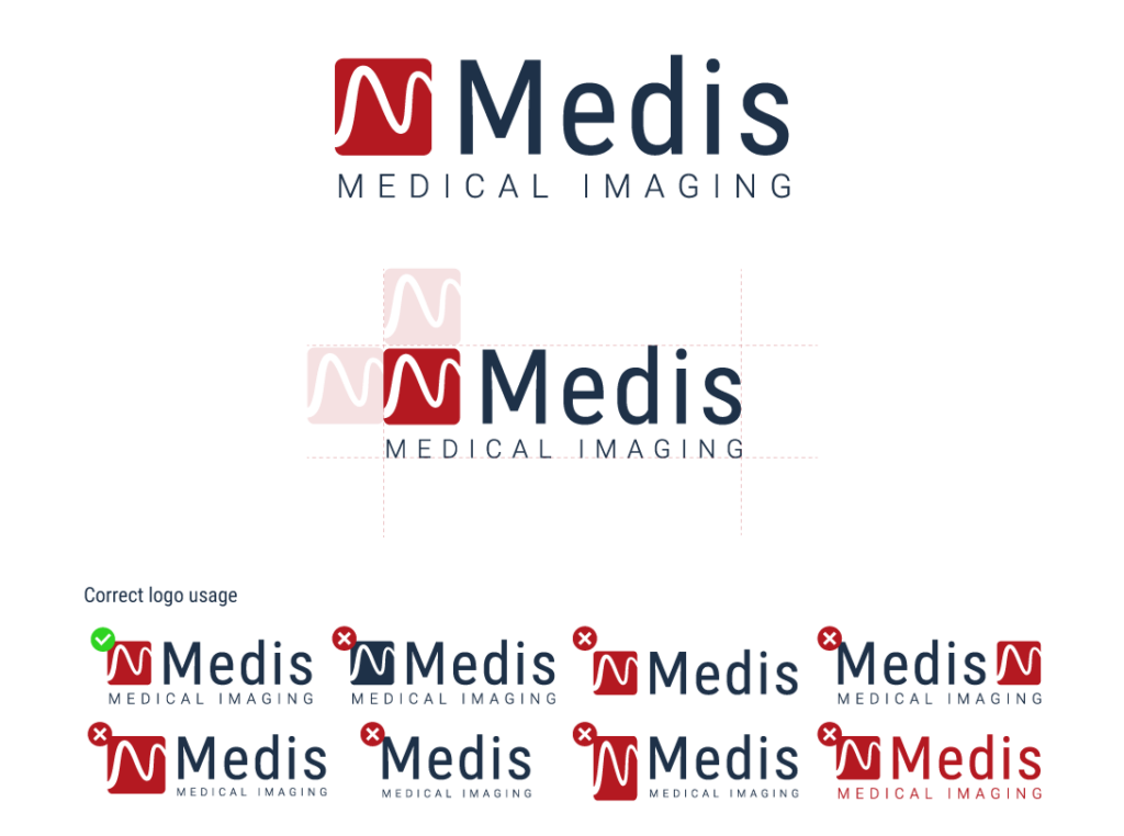
The Medis logo is a combination mark and consists of an icon and a wordmark. Whenever the logo needs to be placed on a dark background, a full white version is allowed as well as a combination of the red icon with a white border and white text.
The logo will in all cases consist of the red icon, on the left, to create consistency and memorabiltity.
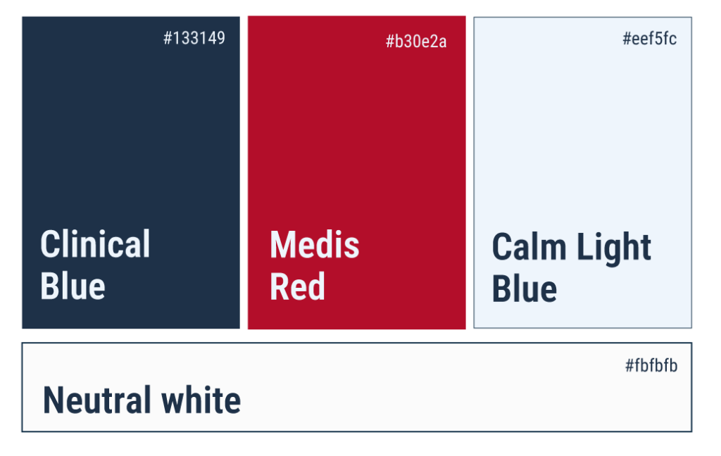
The main colors that Medis uses are dark red, dark blue, white and light blue. Besides these three main colors, different shades of these colors are used. Different shades of the red and blue colors are only allowed if additional colors are needed and are not used as substitutes to the central brand colors. Situations in which additional colors might be needed, could be the design of a UI interface, a graph with multiple colors or on booth designs and/or graphical elements.
Clinical Blue: #133149 RGB 19-49-73 CMYK 74-33-0-71
Medis Red: #b30e2a RGB 179-14-42 CMYK 0-92-77-30
Calm Light Blue: #eef5fc RGB 238-245-252 CMYK 6-3-0-1
Neutral white: #fbfbfb RGB 251-251-251 CMYK 0-0-0-2
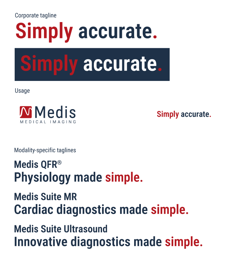
To convey the overall brand’s essence the tagline “Simply accurate.” is used. This tagline is obligated to be on all marketing materials that incorporate the Medis brand. This tagline needs to be positioned across the logo (center-aligned) on the opposing side of any document. When placed on a dark background, the ‘blue’ parts will need to become white.
Next to the overall corporate tagline, there are variations for our various software solutions. Medis QFR® is using “Physiology made simple.”, whereas our diagnostic products, Medis Suite MR & CT are using ‘Cardiac diagnostics made simple’. Medis Suite Ultrasound uses “Innovative diagnostics made simple”. These taglines are placed underneath the names of the software solutions, preferably on 1 line.
To remain consistent in the Medis branding, whenever co-branded, elements from within the logomark are used to determine the size and spacing. The space between two logomarks (Medis & Company X) is exactly the size of the red Medis icon. The dividing line is positioned in the middle between these two logomarks. The height of the dividing line is derived from the Medis logomark with the subline (medical imaging) added to the top and the bottom. Whenever multiple logomarks are used (more than two), this process is repeated until the desired no. of logomarks is presented.
In co-branded instances, the full logomark of Medis needs to be used. The use of only the icon or the wordmark is not allowed.
For Medis, our tone of voice is both a reflection of our brand’s personality and a guide to how we communicate with our audience. It’s crucial that our messages resonate, informing and inspiring our community. Our tone of voice guidelines are designed to achieve a balance between simplicity and science, together with a sense of excitement.
Use straightforward language: avoid jargon and overly complex terminology. When technical terms are necessary, follow them with clear, simple explanations.
Be concise: deliver information in a short, easy-to-understand manner. Aim for briefness in all forms of communication to keep our audience engaged and informed without overwhelming them.
Be accurate: ensure all communications are grounded in reliable, up-to-date scientific research. Accuracy builds trust; it’s essential to maintain it in every piece of content we produce.
Show expertise: while maintaining simplicity, it’s important to convey our deep understanding of medical science. This reassures our audience of our competence and authority in the field.
Use active voice: an active voice makes our content more dynamic and engaging. It also helps to clearly assign actions, making instructions or advice more direct and powerful.
Encourage action: inspire our audience to take proactive steps towards their goal. Highlight how our products or services can empower them in this journey.
Convey enthusiasm: our passion for health innovation should shine through. Use language that reflects the exciting possibilities of our advancements.
Focus on positive outcomes: highlight the beneficial impacts of our work and products. Emphasize improvements, solutions, and progress, inspiring hope and optimism in our audience.
Icons are an essential element of any interface, packing an informative punch into a small form factor. They’re designed to be simple, modern, friendly, and sometimes quirky. To ensure consistency and readability, their limited size means that each icon must strictly adhere to guidance while still expressing essential characteristics.
The icons used for Medis are from the Google Materials Design Library. The full library can be assessed using the following link: https://fonts.google.com/icons
Note: make sure to use a weigth of 200, a grade of 0 and an optical size of 24 and download the icons in SVG format.